


Meetings, interviews & survey
Results based on 20 participants
6 in person, 14 online
Topics in conversations and online meeting:
• Challenges and difficulties in the job
• Overall app's user interface (UI)
• Necessary communications
• Station's situations
• Minor emergencies
• Driver expectations
• Navigation system
• App features
Ages 23 - 45 years old


IMPROVEMENT OF USER EXPERIENCE
AMAZON FLEX
As all we know about the talented respective designers in Amazon corporation, there's always room for improvement in mobile apps world. This case study outlines hypothetical design features aimed at enhancing the user experience of the Amazon Flex mobile app.
I used some sort of Participatory design/Co-design method for this project, because I think users who are professionally work with an app to get paid or do specific tasks to reach a goal in a daily manner, and should do work in the app for at least 2 or 3 hours continuously, should have a peaceful and smother experience for the best company's benefits effort.
On the other hand, there are many challenges and situations in the nature of that job which needs to be seen from inside, and it's tough to sit behind our computers and empathize with these kinds of users.
So, I decided to run a boldly project. In the first step, to gain firsthand understanding, I registered in Amazon Flex to see what is really happening in this job, because I have no idea about the nature of the job which I have never done before in my life.
Secondly, I find some friends who are doing this job, some of them doing this as a full time job and some doing it in a part-time manner or just for their weekends.
Third, ask them to join me in this design process to make it a kind of collaborative design process.

Problem
IDENTIFYING USER EXPERIENCE CHALLENGES AND IMPROVE THE DESIGN.
Every user wants to work with a reliable mobile app to meet their expectations along with a delightful experience, Every company wants to get more benefits through their mobile app... So the mobile app must have an intuitive and engaging user experience and work reliable and flawlessly to make a win-win deal for users and the company.
Project specifications
This project is a collaborative design or co-design project to improve user experience of Amazon Flex mobile app.
Duration
40 DAYS
My roles
User experience (UX) designer
UX strategy
Interaction (IxD) designer
User Interface (UI) designer
UX researcher
Tools
Adobe XD
Figma/FigJam
Adobe illustrator
Adobe Photoshop
Zoom/Google meet/Telegram

Strategy

OVERALL USER EXPEIENCE


the total number of people who collected money from platform geek work, more than tripled between 2017 and 2021.
(CNN - Jul 25, 2023)
Accordingly, the scale and criticality of this mobile app market, a comprehensive analysis of user flows and process design is imperative, alongside with precise consideration of all user experience touch points.


Hypothesis
IMPROVEMENT
All companies try to make better environments for their employees to gain better efficiency in the business, in our context, the main environment for drivers (users) is the app, thus Amazon Flex simply could make the business more efficient by improving the environment for their drivers (users).

Emphasize
Drivers (users) expect a demonstrable understanding of their occupational challenges and pain points, coupled with clear communication of how the app's features will positively impact their job efficiency and service quality.
User personas


Key insights
Participant likes the simplicity of the app, but they want more feature that gives them more freedom and flexibility in the delivery process, and all of them believes this could improve efficiency of their delivery process.
One of the biggest frustration is inaccurate delivery location information, like wrong access code. So the delivery location information would be one of the most critical part of the app and it could be more accurate and organized.
Based on the name of the app, flexibility is the most important topic in the app's values. Drivers thinks this flexibility could improve to cover their needs along with the brand priorities.
Every driver wants to do the job perfectly and earn efficiently through the app, by focus on all aspects of the word "efficiently" we should increase user satisfaction which directly will effects on the company's goals.

Define
How to increase user satisfaction to create a room for delivery efficiency?
Competitive analysis
Does the competitors are doing well on delivery efficiency ? Not exactly


The FedEx Ground Contractors' systems, structured for compliance and adherence to procedures, and not individual drivers. The focus is on ensuring every package is delivered according to FedEx's stringent standards. Drivers are expected to follow established protocols, even if those protocols result in less efficient workflows.
The Walmart Spark app, while excellent at integrating with Walmart's systems and prioritizing order accuracy, doesn't heavily emphasize route optimization or speed. Drivers may find themselves following less efficient paths or dealing with time consuming in store pickups, potentially hindering their ability to maximize deliveries within a given time frame. The focus leans more towards fulfilling each order correctly rather than efficiency of the delivery.
And, I must add that many of these subjects that I focus on my analysis are just to compare the delivery job efficiency in this case study, and in business we should consider the company goals first, and in some cases the other parts of the whole delivery process may more important to a company based on their business strategy, so we all sure respective brands like FedEx and Walmart are the best in their profession.
Ideation
Design recommendations

COMMUNICATION
Create a smooth and managed communication between the driver and customer align with Amazon customer support standards.

NAVIGATION
Make a featureful navigation, to give users(drivers) more freedom on the road, because %85 of their work is driving and it could make a significant efficiency in their deliveries.

REWARDING
More accurate and tangible rewarding system by looking deep into the real and users(drivers) favors to give them more satisfaction and of course it brings efficiency.

INFORMATION
Establish a comprehensive and up to date delivery location information, and encourage all drivers to update information for help of others.
Current design
Samples of existing design

Communication
Navigation
Information
Rewarding

Low fidelity wire framing
Paper + Pencil


Part of the thinking process, using pencil and paper and sympathy with a user (driver) and try to see the problems through their eyes during working hours of deliver about 45 packages in days of heavy traffic and nights full of dark.
Mid fidelity Figma wire framing
Digital transition


Here is some of wireframes which I design in Figma in first attempt and show how is the current design and how the design could improve for better user experience.
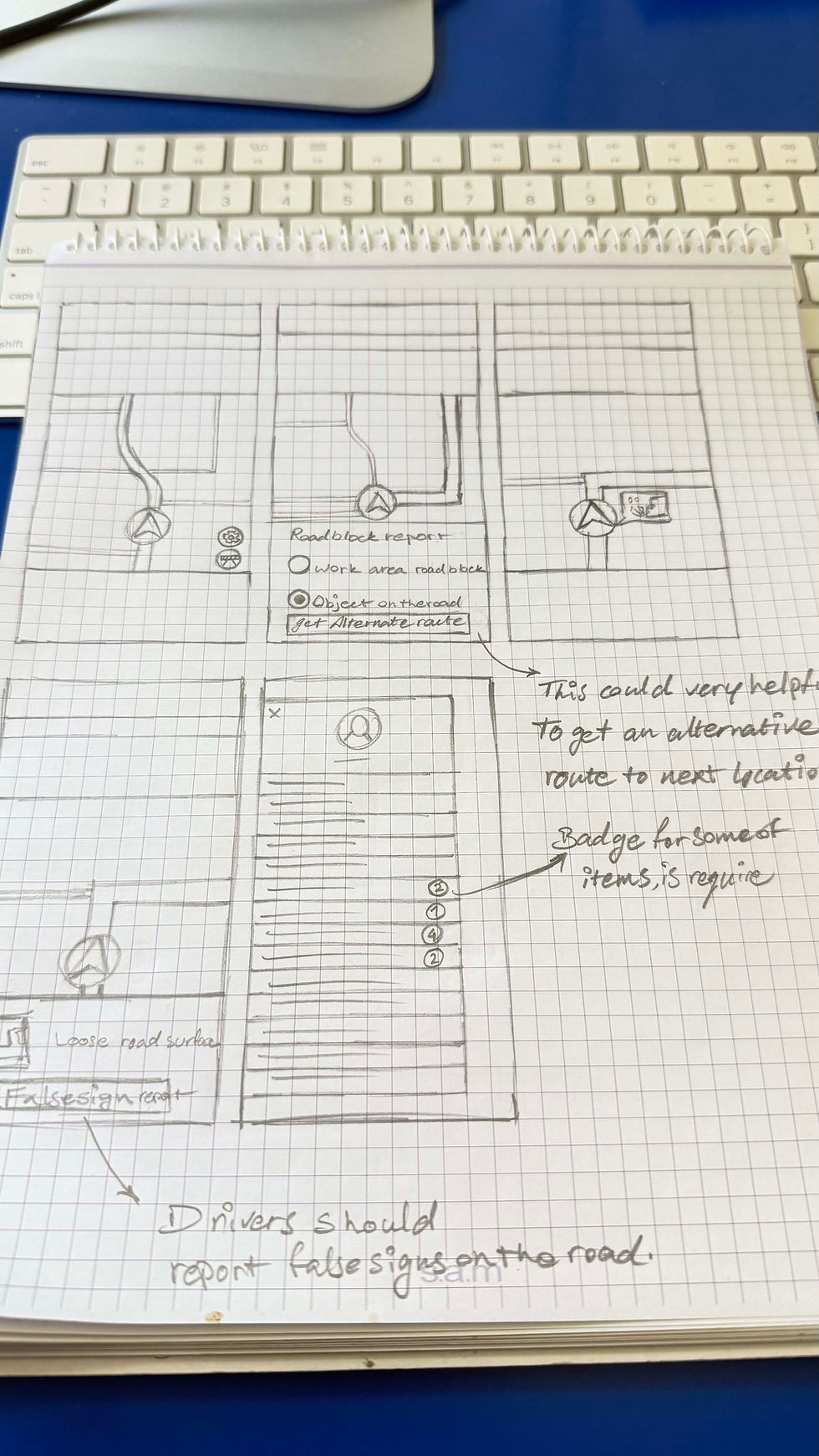
Caution sign report tool
Drive safe
On many routes, there is a need for a sign in the navigation, especially at night, because every location for the driver is new and they focus on the navigation to find the delivery location. If drivers could report this sign to others, it could avoid many incidents during delivering packages and simply the sign could be shown on the navigation by algorithms like other navigation systems.
Types of locations
More accurate delivery
Current design

Navigation could be more helpful and more efficient during the delivery process, by looking into real challenges of drivers in-site. Nearly all drivers who were asked in this study, experienced low fuel alert in delivering a block of packages and facing road disclosure.
A new feature called Alternate Route could help them to find a new route based on the situation faster without any delay to finding an alternative way.
Alternate route tool
More accurate, More efficient
Map setting
Bring more FLEX to the Amazon flex
By adding some minor changes to the map setting, can bring huge satisfaction for the users based on the opinions of the real users. Over %90 of participants in this study were excited about a tool that could help them to rearrange the order of delivery locations and they could set it by their next place they want to go after they finish their deliveries, and they believe this could have a positive effect on fuel efficiency in long term work.
High fidelity wireframes
A bit change, A big satisfaction


Current design
New design


New feature that assists drivers in organizing packages in their cars and minimizes the time spent at pickup stations. It is a recommendation that could enhance satisfaction for app users (drivers) and Amazon associates at the pickup stations.
Barcode reader same as the current design.
Large scanner for the quickest scan.
A customizable tool which shows a standard car schematic, helps drivers to arrange the packages in the car to make their deliveries faster and more efficient.
“3” is the delivery order number, “B” is where you should put the package. When you customize it and turn a spot off, the app automatically organizes packages from the first available spot.
It’s heavy package, so put it on “E” spot to easily lift it up at the delivery location.
The ability to share driver experiences about a delivery location with other drivers to help the fastest and smoother delivery process for all.
Current design


Users believe the types of delivery location can give them a better experience of delivering a package.
Delivery location types

The new home screen design has more engagement and makes a smoother user experience by visualizing the main menu of the app, and, of course, Updates, which has a high level of importance in current design, still is the boldest element of the home page.
Current design
New design
These are some of screens of high fidelity designs.
Lets save some times
Organizer tool
Be more informative
Delivery location information
First impression matter
More engagement means motivation, enjoyment, flow, immersion and positive emotional response
Current design
Usability testing
Determining efficacy
In the pursuit of excellence; however, step by step improvements, guided by usability testing, are crucial for achieving success.


Add an option for this situation to help drivers make deliveries smoother, as it often requires contacting customer support to request a wider delivery area for taking a picture to confirm the delivery.
Some times customers have a specific box for the deliveries, and in most of the occasions the box is far from the exact delivery location (Home).

When delivering in the dark, this torch feature in the confirmation picture taking plays a crucial role, because drivers use this, to watch their steps into leaving the package area.

Now, we have a problem: they are delivering packages, so one hand is always occupied, sometimes both hands are busy, and it can be difficult to use the torch feature with one hand.

A slight change in design could make the app more accessible by using the torch icon on both sides.
Vibration at delivery locations to notify the driver that they are near the delivery address, helping to avoid passing it, turning again, and wasting time.
Almost all drivers experience this situation of passing a delivery location by mistake, and participants believe this feature could help minimize errors.
Visibility always matter, the live navigation bar on top of maps is very similar to the top address bar and the main bar of the app.
The live navigation bar should have higher contrast to be more eye catching during driving, helping to avoid mistakes in following the correct route.


As experienced myself and heard from many drivers, one of the real headaches is you need the access code but, the access code that the customer wrote is wrong, and it will repeat for all drivers on that delivery location.
In the new design, I added an option for drivers to report incorrect access codes, allowing support to ask customers to modify and correct them. Over time, all access codes will be updated and function properly, helping to deliver packages on time to customers and reducing the number of returned packages to the stations.


Impact
KPIs
It was a experimental Co-design/Participatory design project for me,
and it was non-implementation project, so observational impact metrics are unavailable.
Key performance indicators that would have been beneficial if there was data to analyze are listed below.
Efficiency & Operational Performance
-
Decrease return package rates
-
Reduce incomplete deliveries
-
Shorten delivery times
-
Minimize errors in locating delivery addresses
-
Reduce pickup times
Driver Experience
-
Increase driver satisfaction
-
Promote safer driving
-
Improve navigation experience
-
Increase accessibility
-
Enable smoother communication
Customer Satisfaction
-
Enhance customer satisfaction
-
Customers receive packages by their instructions better
-
Overall satisfaction of the delivery system
Takeaway
Important lesson learned